Whether one is beginning or an established professional, the reality is that using some kind of source image or even drawing from reference is something that we all do and need at some point or another. In my case, the use of reference pictures is the basis of my work as I rely on them to develop the drawing and capture texture and definition that I aim to achieve. However, in order to step out of copyright issues, I try as much as I can to provide myself with my own reference photos. While I am no professional photographer, I did a lot of prepping and retouching images as a graphic designer so, in this post, I will try to show you this little tips on Photoshop I learnt along the way and how I use them.
Typically, since I focus mostly on food, I start obviously by deciding the subject of the painting and by making a light sketch. During this process I roughly think about the composition I want, how many items to display, volume and lighting, although I have to say that I am still learning about these last two very important aspects of both painting and photography. Sometimes I just play around with household groceries, specially if it is a personal piece but it is preferable and time-efficient if you do some planning ahead. It all involves practice, in my case, too.
After the planning stage, it is time to choose the best place in terms of light and space to I lay down the chosen items but, quite frankly, most of the time there is no such place. So, I have to opt for wherever I can work best from. On a white surface such as a a roll of white paper, cardboard or foam, I position my elements. In this post I am going to show you one example of all this and not precisely the most perfect one, so that you can see that even with not-so-good circumstances, one can still create the desired illustration. In case you don't believe me, here's the original picture I took for my illustration:
As you can see, there is no light diffusion, the shadows are too hard and the final image is dark and even a little blurry. I must say that took it with my iPhone, in my kitchen and with no natural light. While I could have used Snapseed app to correct some aspects and achieve very good results, I did prefer to use Photoshop on this one. So, let's see how I turned this spookier than Halloween image into my own reference photo.
step 1: ADDING BRIGHTNESS AND CONTRAST
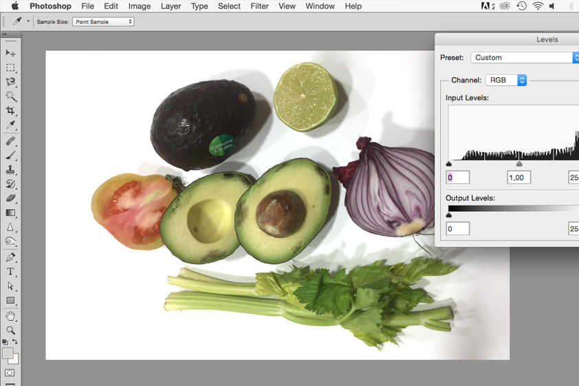
With the image newly-opened in Photoshop, as I explained on my previous post on how to edit illustrations in Photoshop, I use the Levels Adjustment (Cmd+L or Control+L) and by clicking the little droplet or eyedropper on the right (as you can see in the image below) which sets the white point for the piece. Then, I identify an area in the image that I want to be the whitest part and click it:
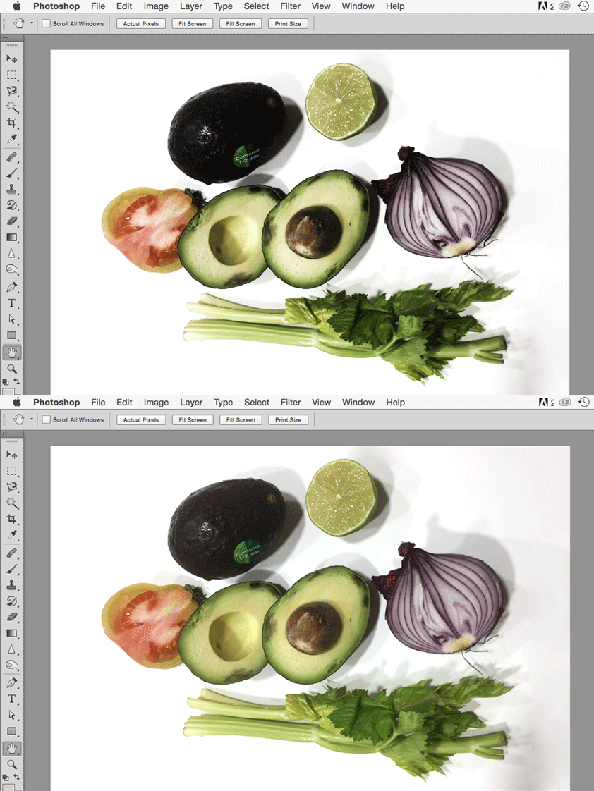
Now, the image has acquired some brightness:
After that, I still needed a little bit of contrast, though. I duplicated the layer and on the last layer, I applied the Desaturate Adjustment (Shift+Cmd+L or Shift+Control+U), so that the bottom layer looked like this:
Now, in order to make that contrast work, I selected the top layer and chose the Hard Light blending mode and lowered the opacity on that bottom layer so that the contrast was not too intense. It might sound complicated but it is actually not and you can use it with all your pictures. The key is to find balance and smooth the effect that is why decreasing the opacity of the desaturated layer is so important. See the changes:
Once I achieve the desired level of contrast, I select the two layers and by pressing Cmd+E or Ctrl+E, I merge them into one so that the effect is permanent.
Step 2: SATURATION AND DEFINITION
That is probably my main concern when I use my own pictures, since I focus a lot on color and sharp images. Now, in this stage I apply the High Pass filter. The what? Just go up to the Filter menu in the Menu Bar and then choose Filter>Other>High Pass. This filter gives definition to blurry images and while it doesn't work miracles, I have used it a lot to improve the sharpness of a lot of pictures. What it does is that it increases contrast along the edges of objects in an image. So the sharper the edges, the more definition the image seems to have. Once again, the key is to not overdo it and find balance and, of course, the desired effect.
So, you see, first, I duplicate the remaining merged layer again and on the top layer this time, I apply the filter as indicated:
You will see that the image turns grey and there's a pop-up window that shows a Radius value for us to adjust how much highlighting will those edges get. Although it depends on the image, I normally work with a value of 3 to 6 pixels to achieve a got level of definition and avoid pushing the values too far.
Now that I have set the Radius value, it is time to blend the result with the original image. So, again, I select the High Pass layer and pick the Overlay blend mode for this one and adjust its intensity by lowering its opacity.
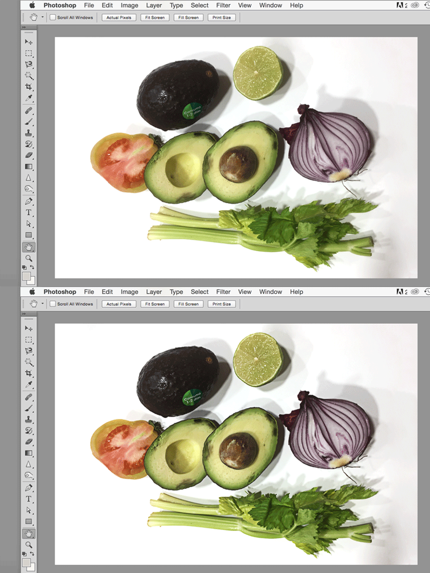
A little subtle animation so that you can see the change in definition.
What is left to do now, at least what I normally do in all the photos I take is to increase saturation a little bit. Since I already aim to achieve vibrant colors, I push the saturation a little so that I can have a better reference. So, I go to the top Menu Bar and follow Image>Adjustments>Hue/Saturation or just press Cmd+U or Ctrl+U on the chosen layer.
As you can see on the image above, in this case, the Saturation middle section is the only one that I am interested in. So, I just drag the slider a little bit to the right to increase its value. They can range from ‑100 –thus getting a desaturated or black and white image– to +100, in which the intensity of colors bursts. Once I have the desired value, I am done with the photo.
See the change? For me it is specially useful to get a proper assessment of colors and textures that I couldn't properly identify with the original image I took. This is the final illustration I made and while, I should have worked on shadows and volume, I still managed to use it:
I am still learning and trying to accomplish better photos, this is how I edit and use my own reference pictures. Also, for those cases where I don't have the best scenario –practically always–, these Photoshop tips come in handy.
I hope they were helpful for you, as well, as these were basically tips I learnt as a graphic designer but I apply to my illustration work, as well. If you know further tips or ideas, just leave a comment below so that we can all learn from it.
Thank you for reading and have a great Halloween! 🎃


