When I was commissioned with my first illustrated recipe I had to figure out the best way to showcase my artwork and, at the same time, visually –and beautifully– interpret a dish that someone had entrusted me with. Whether you are doing it for yourself or for a client, in this post I would like to cover up the process that took for me to find the best way to accomplish that and also other considerations and inspiration that I found extremely helpful. There are many different approaches and angles to go over illustrating a recipe but this is just my own.
What’s your flavour?
I believe that the first step to creating a recipe illustration is identifying its purpose. Whether it is purely a decoration or an educational material, you will have to apply your style to those specific needs. At times, you will be the one designating that objective and other times clients will do that for you. In any case, I feel that serving its purpose should be the ultimate goal while also doing the kind of work that you want to be approached for.
The second step after that should be applying your strengths and style towards that goal. In my case, I understood that I had to use the skills the best represented me and that I felt happy with. It can be creating patterns, botanical illustration, character design or lettering... It can be a loose style, a realistic one or an expressive approach, anything goes! From that perspective, it will be easier to identify if you concentrate on the ingredients, the process, the finished dish or another type of narrative or storytelling. For me, it all boiled down to a realistic and detailed style, focusing on ingredients but also on a very clear representation of the makings of the dish. Does that make sense?
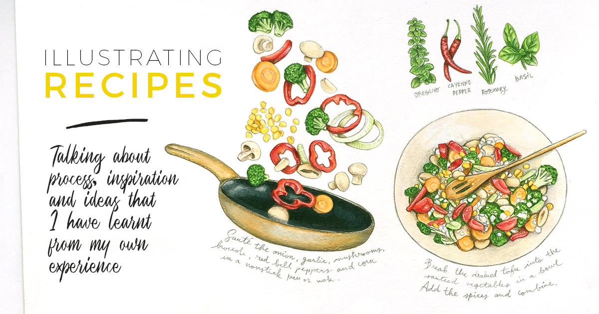
Detail of the my latest commission of a vegan lasagna recipe.
Movement, always movement
Another important concept when working on an illustrated recipe is movement. The opposite would be having a static illustration which is not something particularly appealing to the eye. That movement can be achieved by creating a dynamic composition, playing with the scale of the elements or even by the way colors are combined and used. I feel that movement helps create a more organic feeling for the final piece which makes it more beautiful. It was a major element for me when I designed and it is something I take into account now.
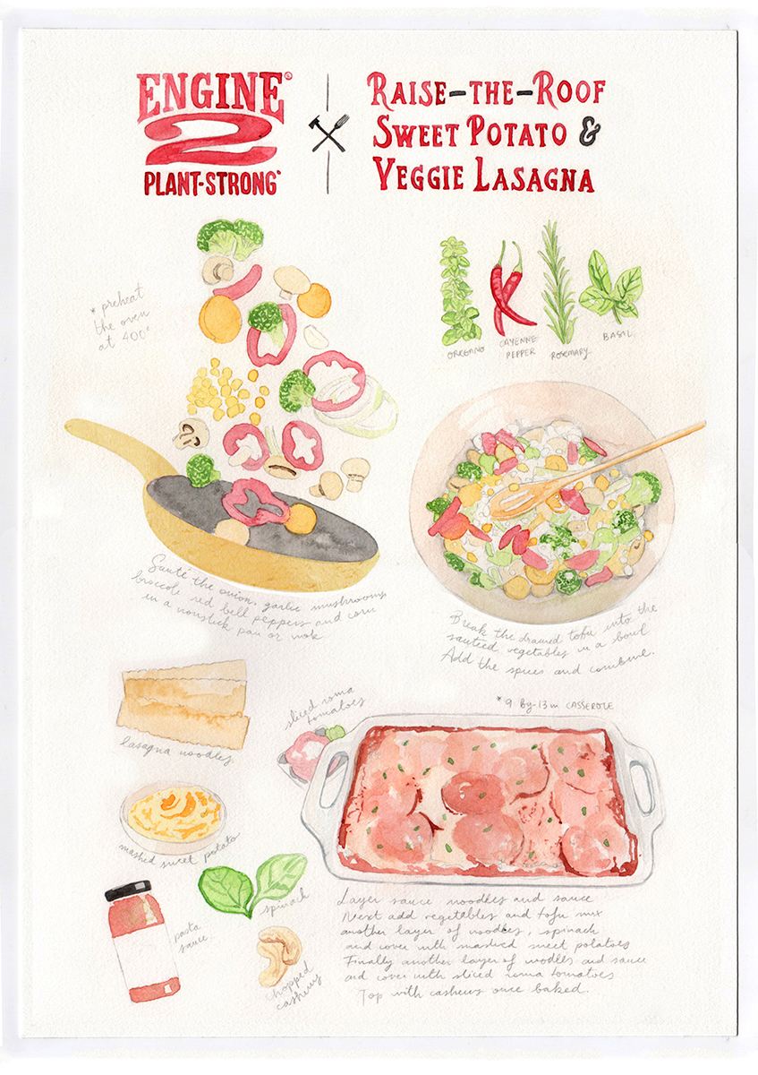
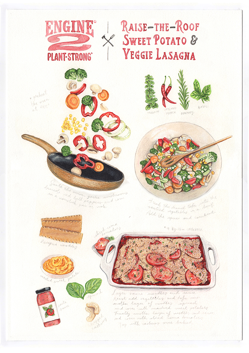
For instance, in my last illustrated recipe, I opted not only by using different scales of elements and dominant colors but also by actually creating movement with the ingredients, as you can see here:
Full layout of my last illustrated recipe commission.
You will find many other wonderful examples of illustrated recipes online –some of which I will share later– and the common thread that runs through all of them is how dynamic they look.
Another important consideration when creating a vibrant, balanced and eye-catching composition is the "rule of thirds" often applied to photography to establish those areas in which you should consider placing points of interest as the eye will most likely be drawn subconsciously to those sections of the image. Have you ever heard about it? If you haven't, take a look at this explanation from the Creative Bloq which I think is very good to visualize what it consists of and apply it on future layouts.
It’s all a process
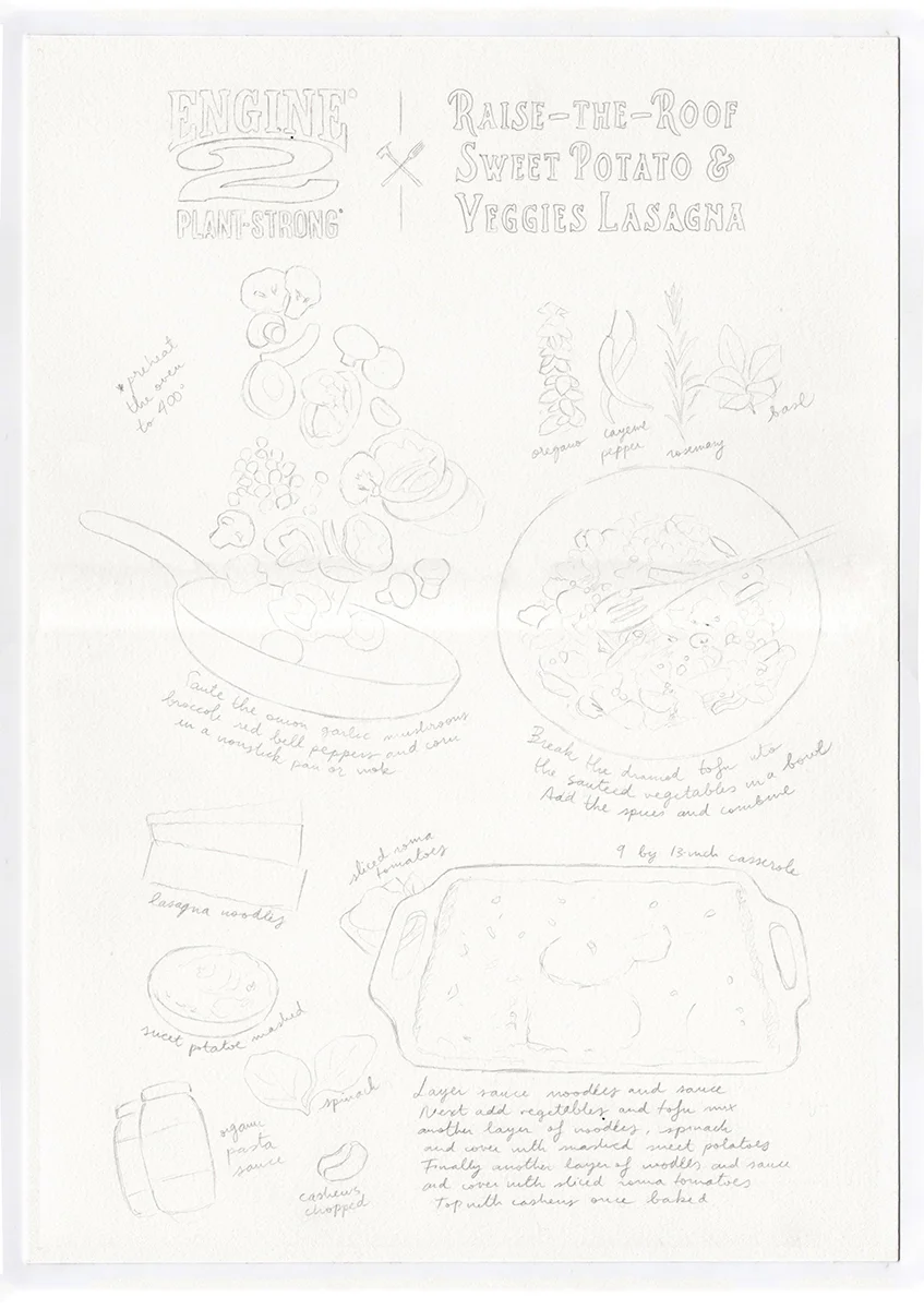
As it happens with almost everything else in life, initial preparation saves a lot of time and effort afterwards. I realized that pretty soon. For my type of illustrations, just sketching at first won't do. I need to fully visualize the whole piece before I draw it. So, I use different combined reference pictures that I find online and that I arrange either in Photoshop or InDesign in a page that has the same size as my final piece. That allows me to determine scale and position of the illustrations and figure out the necessary space for my handwriting text.
At this point –once I am satisfied with the composition—, I proceed to make a light pencil sketch which I will send the client to review. As I said, being thorough conceiving this primary sketch is essential to achieve good results. Of course, there is always room for changes at this stage and with revisions those might happen but I feel much more confident if I have reviewed and planned my illustration.
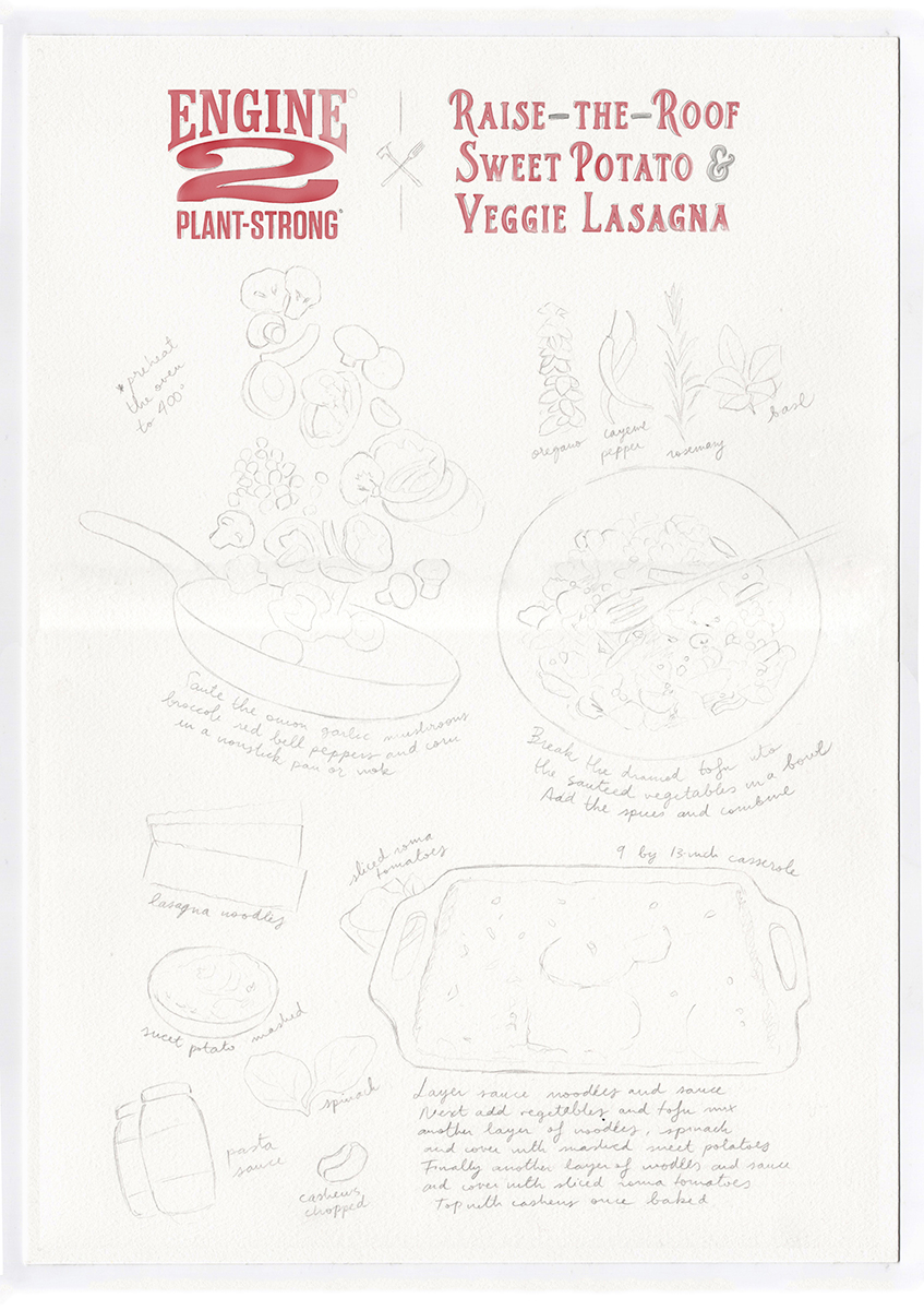
From this moment on, provided that the illustration sketch is satisfactory, it's time to start painting! My process involves starting with some washes of watercolours to define the tones and dimension of each element. Then I use coloured pencils to define and complete the illustrations. I tend to add highlights with white gouache and finish off with my trusted pencil to contour and add more dimension to the whole piece. Last but not least, I handwrite all the text while being very careful not to mess up with all the illustrations. It feels tricky but I also do it in pencil so that I can go back and redefine. Sometimes I feel like that Mission: Impossible sweat scene but it is all worth in the end.
Before I send it to the client, I apply protective spray throughout the illustration and voilà! Here's a slide for you to check my process:
Beautiful inspiration
If you research for "recipe illustration" or "illustrated recipe" through Pinterest you will find all sorts of fantastic examples. That is the way I discovered the lovely artworks of Lucile Prache and Felicita Sala. While their style is very different than mine, I just love their approach to this type of food illustrations and also their use of their own handwriting.
Now, the place where you want to check for the most extensive selection of food artists and illustrators would be the page They Draw and Cook. Run by Salli and Nate, they offer the possibility to submit your own recipes and create your own portfolio of illustrated recipes there and even promote your work through them. You will find the inspiring works of its co-founder Salli Swindell and of wonderful artists such as Ohn Mar Win, Liv Wan, Marianne Scheel, Sandra Neuditschko and many more... Even mine!
Also, being a vintage fan, I really get a lot of inspiration from older books, specially cookbooks like Mrs Beeton's Cookery books or one of my most treasured possessions A Treasury of Great Recipes by Mary and Vincent Price, an incredibly beautiful book in itself in which you find little lovely illustrations all along. Vintage and contemporary botanical and scientific illustrations are always in my vision boards when I start a project. I can't help but marvel at the proficiency of each piece and it is a goal of mine to always improve in that direction.
That's all folks for today's post! I really hope you found this useful and inspiring in some way. Let me know in the comments section below if you learnt something new or if you are curious about any specific topic or idea, it would be great to know. If you would like me to cover some areas in particular or have any doubts, I would be glad to dedicate another post to them.
If you want to commission an illustrated recipe for a family member or a friend or just for yourself, you can now do so directly by clicking at my Shop or for more personalized commissions, feel free to write me an email with all the details.
In any case, thank you for reading!
Wishing you all bon appétit,
Miriam

