Hello friends! This last weeks I have been quite busy finishing and preparing my first round of print promotion or promo mailers –as I have seen also online– of my illustration work. As a former graphic designer, I have to say I had never used this marketing strategy to access companies, although I had been advised about it in my student years. Again, just like I said in previous posts, I am no expert on the matter but I hope that by sharing my experience you might get some inspiration.
First of all, let's state that promotion is key and one of the decisive aspects of pursuing art as a career. Whether your are at the early stages of your creative career, you are shifting paths –such as myself– or you are an established professional, you need to get your work seen and reach out to potential clients. While there is no one right way to go about it, print promotion has been and still is a popular an effective method to get your work in the hands of art directors or editors, which are the primary target for illustrators.
Initially, I had no idea how to start with promotion other than sending emails or posting on social media, to be honest. As I started with illustration, I became a member of the Association of Illustrators as I needed recommendations and help on basically everything. In terms of promotion, I was advised via portfolio consultation that the best way to do it was to send a print sample via mail instead of sending emails, as I was solely doing in the beginning. The main reason for that approach is that art directors and editors get a lot of spam and unnecessary emails a day and they can be easily discarded. However, having a physical sample of somebody's work is less likely to be dismissed –although there is no guarantee– and, plus, it shows an effort on your side.
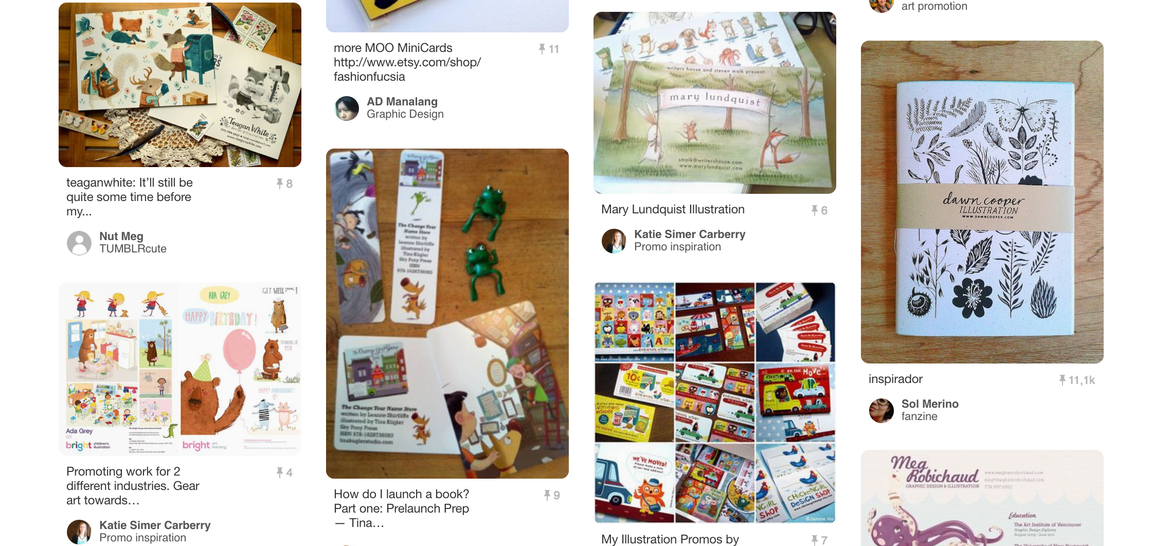
There is a process in conceiving, producing and, finally, sending print illustration as I have come to experience. For me, probably because I had to start from scratch, the whole process has taken about two months of work. First, you need to build a portfolio which, luckily, I had already done, since the point of the promotion is directing it to you and your work. Second, you need to figure out the final format and the pieces you are going to use to showcase your skills. Albeit there are many options, I found that postcards where the typical and handy format in which many illustrators promoted and launched their work. You can find many examples, as I did via Pinterest for instance. I would say that research is very important in any case. I finally decided to use the idea of a postcard but with a square format so that it was a little bit different.
Some of the examples I found on Pinterest.
I was told to do about two or three to provide a little more variety of artwork and so I did. I chose those illustrations that I thought could work together best in three arrangements grouped by color and theme in order to make them a little bit different one from the other. Another very important part is to add your contact info, specially portfolio –as I mentioned earlier–, email address and I would say social media accounts, those you are particularly present in.
In my case, I decided to print them in fine paper and, thus, produce a smaller quantity to start with. This was my personal choice, since this was my first approach and I was also counseled to choose clients wisely. That is by researching again and finding out which magazines or publishing houses my work would suit best. I resorted again to Impressionart but I also found out that places like Awesome Merchandise –which I used to print some stickers–or Moo could be a good option for future promotion.
I finally worked on a brief, short and sweet focus letter to send along these postcards in order to introduce myself and my work and appear available. Again, an important part was investigating publications, addresses and the right person in charge to contact. This is still somewhat difficult and I hope to improve the process as I go along. So, if you find yourself in this situation too, be patient and work hard at it. If I can do it, you can do it! I cannot yet share the results of this process but I can assure you that I did my best. I also bought kraft paper envelopes and round stickers to create a consistent look that I believe is also important in order to build up your personal and professional image.
Again, I hope you all find it useful and, since this is an open conversation for me, feel free to comment on your experience or share thoughts on the subject!
Do you have any further questions?
Would you like to receive more content like this?
Just reach out to me or subscribe!
Oh yes, I am a big classic film fan, too :)


